

It’s nice to believe that cars are purely about performance — that what matters is track times and vehicle specs, not superfluous details like the assembly of letters that make a name. But it’s not. The automotive world works on many levels, even those that can be the most superficial. Every car bears a name and every brand has a badge. And that name and badge make a difference.
Behind the creation and evolution of automotive emblems there’s often tradition, folklore and mystery. So we’ve compiled a bit of history on the most famous automotive emblems — from Alfa Romeo to Volvo. We can’t cover every car brand, but we can give you the skinny on the major names. True identification in the sea of cars on the road is what every automaker wants, so let’s shed some light on how identification is best achieved.
>
A Quick Primer on the Hood Ornament
Not every brand has a fancy, protruding hood ornament, nor can every brand pull one off. Companies like Bentley and Rolls-Royce lead the pack when it comes to sculpted hood candy, while brands like Jaguar and Cadillac no longer slap sleek leaping cats or wreathed crests (respectively) on their cars. The hood ornament started when radiator caps were located on the outside of the car, rather than in the engine compartment. Companies started making the cap the visual focal point, giving rise to iconic hood ornaments like Bentley’s Flying B, Packard’s Winged Woman or Pontiac’s Indian Chief. Hood ornaments can take the form of a three-dimensional representation of the brand’s emblem, like Mercedes-Benz’s three-pointed star on the 2012 E-Class, or they can be completely separate from the brand emblem, as is the case with the 1978 Ford Thunderbird’s model-specific ornament. Hood ornaments today are viewed as overwrought and detrimental to aerodynamics, to the ornamentalists’ chagrin.
Alfa Romeo
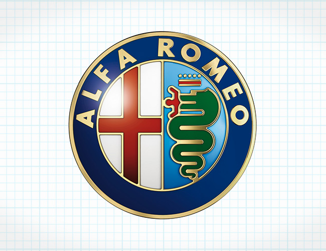
One of the more intricate and dramatic automotive emblems, Alfa Romeo‘s is rife with Italian tradition. The original was created by Romano Catteneo, an Italian draughtsman, and the emblem employs Milanese elements, including the Biscione (shown on the right side of the emblem), which signifies the house of Visconti, Milanese rulers in the 14th century. The left side shows a Milanese red cross on a white background. In 1918, the badge was changed to include a dark blue surround ring with the words “Alfa-Romeo Milano”, along with two Savoy dynasty knots for the kingdom of Italy. In 1925, it underwent further change to include laurels that signify the Alfa P2’s win at the Automobile World Championship, and in 1945 when Italy’s monarchy ended, the Savoy knots were removed. Though at first glance it appears that the crowned serpent is shooting red flames out of its mouth, it’s actually a man being swallowed. This part of the symbol has been very controversial, seemingly symbolizing the Crusades, wherein the Christians defeated the Moors. Suffice it to say the folks at Alfa Romeo don’t much talk about that part.
Aston Martin
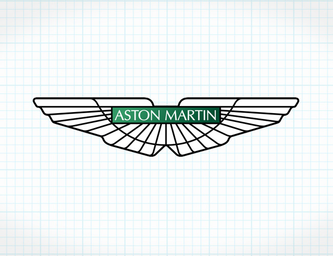
Carmakers love wings, and Aston Martin is no exception. The British carmaker was founded in 1913 by two gents, Lionel Martin and Robert Bamford. While they were selling Singer cars out of their Bamford & Martin shop, they came up with the idea to produce their own vehicles. Some years later, the name transitioned from Bamford & Martin to Aston Martin Motors, born from Martin’s name and the Aston Clinton Hillclimb in Buckinghamshire, where Martin would drive from time to time, no doubt spiritedly. The logo itself denotes speed (hence the wings), but it has evolved over the decades from simple superimposed A and M letters within a circle to, in 1927, a V-shaped winged logo and then, in 1987, to what is essentially the modern version. The emblem today employs straight wings and the Aston Martin name front and center, and it’s one of the more elegant brand emblems in existence today.
Audi
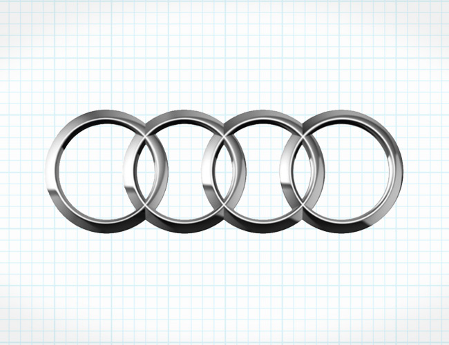
Don’t make the mistake of thinking that Audi has anything to do with the Olympic Games. The four silver rings symbolize the merger, in 1932, of the four oldest car manufacturers in Germany: Audi, DKW, Horch and Wanderer. These four companies formed what is known as the Auto Union, and initially only Auto Union-specific cars bore the four-ringed badge, while the individual carmakers used their own logos. In 1985, the Auto Union name disappeared forever and the Audi name (a Latin derivative of founder August Horch’s last name, meaning “to hear”) carried forth the same German auto-making spirit. It also carried forward the iconic emblem that lives on today, largely unchanged. Rumors have floated around claiming that the emblem symbolized four driven wheels from the Quattro all-wheel-drive system, but that claim has no historical merit. Still, Audi occasionally has made reference to the connection, capitalizing on a bit of synchronicity.
Bentley
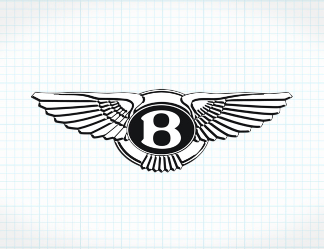
There are few names in the automotive industry that carry as much panache and gravitas as the British manufacturer Bentley Motors. The emblem shows a bold “B” surrounded by a set of spread wings. The hood ornament is similar, with a large capital B and aviary wings that flow backward. The significance of the emblem is the “B” reflecting the Bentley name, after Walter Owen Bentley, who founded the company in 1919. The winged design links to the original company name, Bentley Aero; the company originally manufactured rotary engines for planes during World War I.
BMW
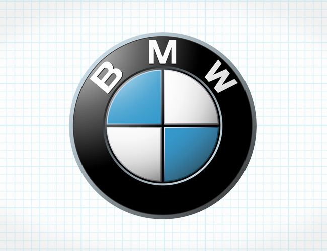
Among Bimmerphiles, the meaning of the BMW Roundel — as it’s officially called (BMW Car Club of America’s magazine title carries the same name) — stirs up a bit of controversy. The latest interpretation (latest being the 1920s) is that the emblem signifies a propeller against a blue sky, representing BMW’s early history of making airplane engines. As attractive as this explanation is, the truth behind the Roundel is far different. When Bayerische Motoren Werke AG (Bavarian Motor Works) was formed out of Rapp Motorenwerke airplane manufacturing in 1928, the emblem reflected the BMW name within a black outer circle, and the blue-and-white Bavarian flag’s panels were placed within a concentric circle at the center. It’s evolved somewhat over the years, but the changes have been minor — font, font color and the appearance of relief in the Bavarian flag checks at the center.
Bugatti
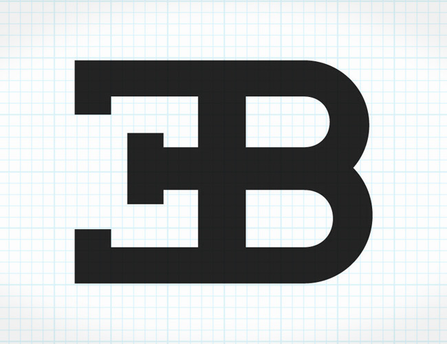
Ettore Bugatti’s initials live on today in his emblem, though an independently held Bugatti company died along with Ettore in 1947. Buggatti was born in Italy, but started his company in 1909 in the Alsace region in France. His cars evoked deep and fluid sculpting, fitting for the Bugatti family’s artistic leanings. After Ettore died, there would be no successor to carry on his name due to the earlier death of his only son. Fewer than 8,000 Bugattis had been built, but the name would not only stand in the record books, but also be revived by Volkswagen, who have since built some of the most exotic automobiles ever made, like the EB110 and the insane Veyron hypercar.
Cadillac
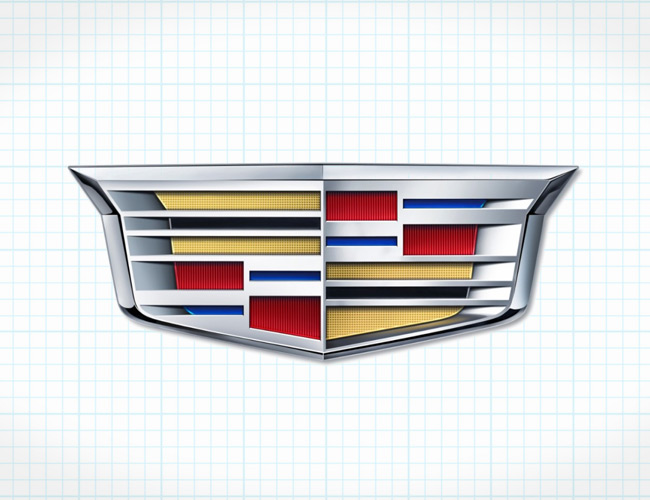
The Cadillac emblem you see today is a modern rendition, yet its initial roots are still easily recognizable. The original emblem represented a family name, belonging to Le Sieur Antoine De La Mothe Cadillac (luckily, the cars weren’t called “La Mothe”). Monsieur Cadillac founded the city of Detroit, Michigan in 1701, and the Cadillac brand bears more than just his name; the emblem bears the resemblance of the Cadillac coat of arms.
Like many other automotive emblems, it has evolved over the years, and its original form was far more complicated than what you see today. The Cadillac coat of arms doesn’t show a shield like the automotive emblem does; rather, it was completely round and displayed trios of merlettes (birds), a symbol of knightly participation in the Crusades, along with a black bar (or “fess”) that also symbolized service in the Crusades and a red band for boldness. In 1905, Cadillac adopted the symbol for its cars, and since then it’s morphed quite noticeably to the modern version that bowed in 2000, largely influenced by the Dutch painter Piet Mondrian. In 2014, the emblem made its most recent change, losing the laurel leaves that encircled the crest and further simplifying the emblem while remaining easily recognizable.
Chevrolet
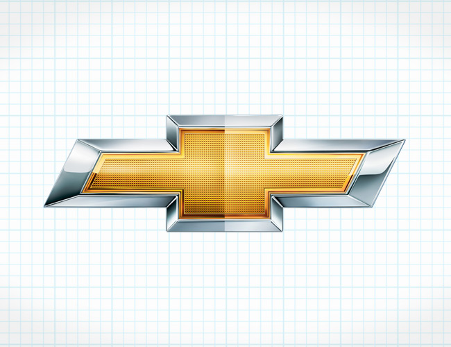
The jury’s still out on the origin of Chevy‘s bowtie. As it’s supposedly remembered by William C. Durant, cofounder of General Motors and Chevrolet, Durant was inspired by a repeating pattern on the wallpaper of his French hotel room. His wife, however, disputes that claim, stating that he was inspired by a newspaper ad for Coalettes that showed the same bowtie outline. There are other claims that Louis Chevrolet designed the bowtie as a modified Swiss cross, in honor of his parents’ homeland. Whichever story you believe, the bowtie stuck. It’s evolved throughout the years, going from a royal blue color phase to the current gold.
Chrysler
It’s now officially known as Fiat Chrysler Automobiles, but the Chrysler name lives on in the Chrysler logo and badging. Originally based on the Kruessler family crest, the Chrysler seal emblem — mated with flanking wings in the 1930s — was meant to represent quality, hence the royal-style wax seal. In the ’50s, Chrysler employed what’s known as a “Jet Age” style log, with two chevrons superimposed onto one another, but it didn’t last long given its temporary trendiness. In 1962, Chrysler’s longstanding five-triangle “Pentastar” logo was created with the idea that it should be timeless and global. It was a logo that was easily identifiable and became synonymous with the ubiquitous K-Car and LeBaron. Then, in the ’90s, the Chrysler seal and wings returned, but with longer and wider wings. The Pentastar came back shortly thereafter, then disappeared forever from Chrysler cars in 2009, when a thin, wide and elegant winged badge took its place. After all the changes, it now looks like the wings are a permanent fixture in the Chrysler logo.
Ferrari
The Cavallino Rampante, or “Prancing Horse” in Italian, is the proud icon of one of the most prolific performance automobile manufacturers in the world, Ferrari. And, in good form, the story of the emblem’s creation is nearly as exotic and storied as the carmaker itself. Enzo Ferrari, the namesake, told a story of his victory at the first Savio circuit, where he met Count and Countess Enrico and Paolina Baracca, parents of an Italian fighter pilot who had flown with a prancing horse emblazoned on his plane. The son had passed, but Enzo was told the symbol would bring him luck (talk about prescience). The horse was adopted and a yellow background was used to represent the town of Modena, the Ferrari factory’s location. But the emblem could not be used for the cars, initially — it was seen only on Ferrari’s publications and papers, since Alfa Romeo technically owned the cars. The shield emblem debuted in July of 1932 at the Spa 24 Hours, and in 1963, Ferrari also began to utilize a relief version of the Prancing Horse, which you still see today.
Ford
The Ford Motor Company‘s emblem hasn’t gone through too many changes since 1903, as they’ve stuck with the Blue Oval from 1927 to now. The original emblem was busy and bore the entire “Ford Motor Co. Detroit, Mich” wording in an amorphously shaped black-and-white background. The script, which has stood the test of time, was penned by Ford Chief Engineer Childe Harold Wills in 1909. The Blue Oval was added nearly two decades later, making the badge what it is today.
Honda
Though there’s nothing particularly original or mysterious about the basic but attractive silver Honda “H” emblem, what the symbol represents is crucial to understanding Honda. The company is named after Soichiro Honda, the company’s founder — a mechanic, tuner and racer who eventually turned Honda into the largest builder of motorcycles in Japan and the second-largest Japanese automaker. Honda’s consumer engines are direct derivations of the versions built for racing, and their quality and reliability are as solid as the stance of their simple but prominent logo.
Hyundai
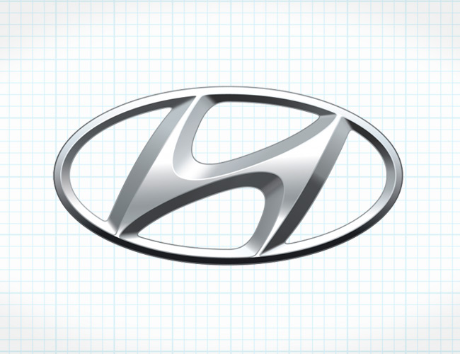
At first glance, you wouldn’t give much credit to Hyundai for their emblem. But the South Korean company created it to be more than just a Honda logo that underwent a taffy pull. The Hyundai “H” represents the name, but it’s encased in an oval to reflect the perpetuity that Hyundai pursues internationally. The “H” itself is designed to symbolize two people shaking hands (how friendly!). And we know that based on Hyundai’s affordable yet quality automobiles, the symbol does not signify a customer handing over his wallet to the salesman.
Infiniti
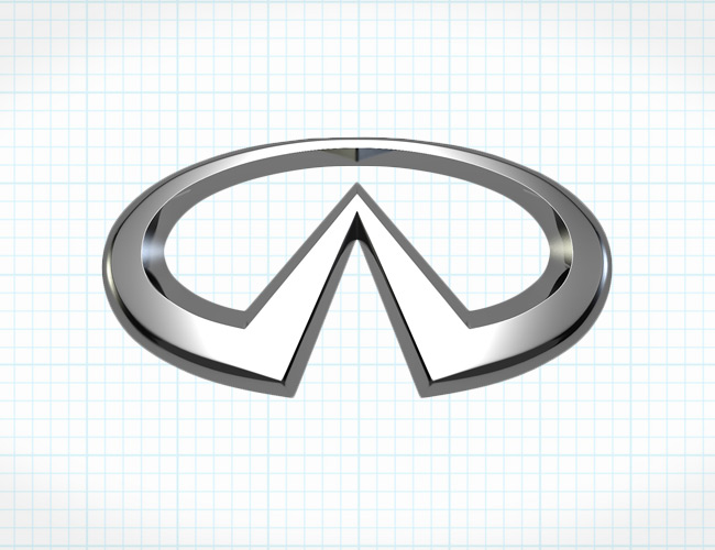
One of the more original but simple modern automotive symbols out there, Nissan’s luxury brand utilizes a partial oval surrounding a road that narrows into the distance, or to…infinity. It’s a tasteful badge and, thankfully, it conveys an actual connected meaning between the brand name and the logo. The logo is similar to Oldsmobile’s logo, which also shows a road driving off into the distance (but Oldsmobile’s road veers to the right). Infiniti has to be around a bit longer before they can lay claim to any iconic cars, but they are well on their way to making some very dramatic statements.
Jaguar
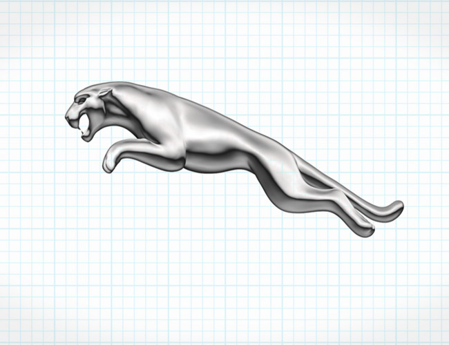
The Jaguar emblem began with a nod to the Swallow Sidecar Company, who produced the SS Jaguar in 1935. The emblem featured the characters “SS” in a hexagon on top of an eagle’s wings and tail. The leaping cat emerged in 1945 and hasn’t changed much since then. There’s nothing mysterious or multi-layered about its meaning. The use of the Jaguar cat is meant to convey power and agility, and Jaguar has done an incredible job of communicating that ethos to the automotive world, especially with cars like the new F-Type.
Lamborghini
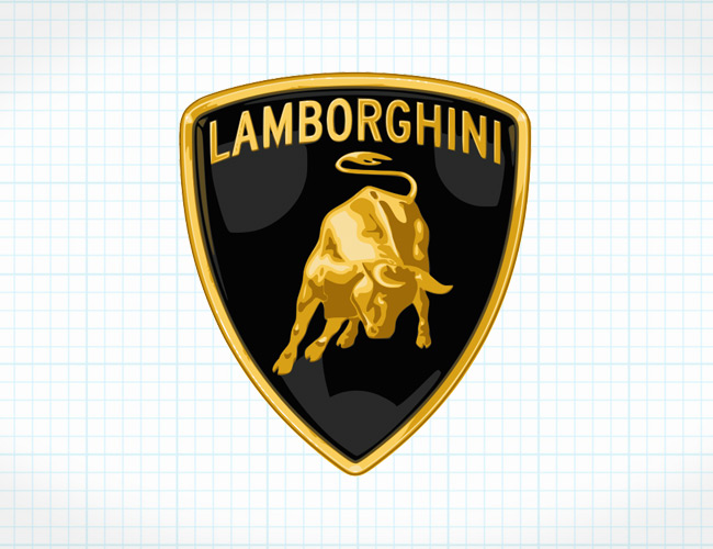
Lamborghini‘s logo traces back to founder Ferruccio Lamborghini’s 1962 visit to Don Eduardo Miura’s ranch, where fighting bulls were bred. So heavily influenced by the power and presence of these animals, Lamborghini adopted the bull as the emblem for his cars. Soon after, he began to use the names of fighting bulls and bullfighting terms for his cars (except for the Miura, which was named after the breeder). Names like Islero, Espada, Urraco, Jalpa, Diablo, Murcielago, Gallardo and Aventador evoke the snorting bull emblem. We’re still trying to figure out the Countach, however.
Lexus
We’d love to elaborate on the meaning of the Lexus emblem, but due to the company’s somewhat limited history (Toyota’s luxury brand made its introduction to the world in 1989) and the simplicity of the emblem, there’s really not much to tell. There was initially some speculation behind the Lexus name, claiming that it stood for “Luxury Exports to the US”, but the truth is that Lexus is derived from the name Alexis, which was the originally planned name. It eventually morphed into “A Lexus” and then just plain “Lexus”. The emblem itself is just a stylized “L” within an oval, nothing more to tell.
Lotus
Lotus cars, founded by Anthony Colin Bruce Chapman (British enough for you?), had their start as racing and road cars. Chapman’s initials are found on the Lotus emblem, which has been essentially unchanged since 1952, when Lotus Engineering Ltd. was formed. The Lotus name’s origin is unknown. British Racing Green (BRG) is found in the background, largely due to the color’s popularity during Chapman’s era. The surrounding yellow embodies the sunny perspective that Chapman saw for his future. Lotus cars achieved much fame, especially in Formula 1 racing, but the company struggled in the ’70s and early ’80s, then was rescued by the sale of the famed Lotus Esprit Turbo in the US market. Sadly, Chapman died at the early age of 54; but his company, after changing hands a few times, now produces some of the best-handling cars around, namely the Elise, Exige and Evora.
Maserati
The Maserati Trident logo has remained largely unchanged since it first showed up on the 1926 Tipo 26. The iconic statue of the god of the sea stands in the Piazza Maggiore in Bologna, Italy, where Oficine Maserati was first headquartered. Neptune stands atop a fountain, powerfully wielding his famous trident scepter — and the statue served as inspiration for the emblem along with Bologna’s colors, red and blue.
Mazda
The Mazda logo dates back to 1936, when it presented as a triple-stacked M for “Mazda Motor Manufacturer”. The logo was allegedly inspired by Hiroshima’s own emblem, as it’s company’s hometown, and it was flanked by some very Van Halen-esque wings that symbolized “agility, speed and the ability to soar to new heights”. Then, in 1959, when Mazda began manufacturing passenger vehicles, they introduced a simplified logo with an “M” in the middle of a circle. In 1975, Mazda transitioned to a new brand image and used only the Mazda name as car badging, a blend of uppercase and lower-case letters at the same height. In 1992, the Japanese automaker introduced a brand symbol that was comprised of a circle in the middle of a curved diamond shape and encased in a larger ovular shape that supposedly represented wings, sun and a circle of light. Then, in 1997, Mazda created the logo that’s still used today: an “M” within a squarish oval that also incorporates a “V” shape and an upturned wing style to symbolize the company’s desire to soar into the future. It’s easily their most attractive logo to date.
Mercedes-Benz
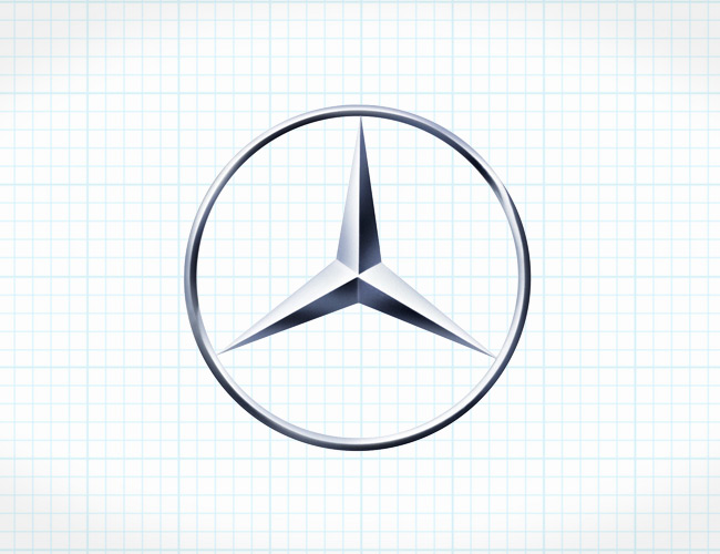
Mercedes, a division of Daimler-Motoren-Gesellschaft (DMG), needed a trademark back in the early 1900s. DMG founder Gottlieb Daimler had passed in 1900, and his sons Paul and Adolf used their father as inspiration — calling upon the star symbol on Gottlieb’s home that represented future prosperity for his growing company. The symbol was well received by the board at Daimler in June of 1909, and both the now-famous three-pointed star and a four-pointed star were registered as trademarks under the Daimler name. It’s the three-pointed star that survived, representing Daimler’s goal of using their motors to power vehicles on air, land and sea. In 1916, the star was centered within a circle and has undergone only small changes, ending with its current silver star in a silver circle.
Nissan
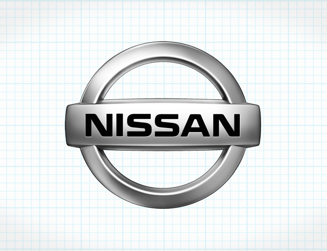
Nissan‘s current logo is a chrome badge with simply “NISSAN” in a silver rectangle centered across a silver circle. Its origins began with the Nissan’s control of DAT Motors, formerly Datsun. The Datsun logo utilized the Datsun name in a blue rectangle over a red circle — Japan’s “Rising Sun” symbol, which appears on the national flag. The existing Nissan logo came about in 2001, utilizing a more modern interpretation of the original emblem, with chrome representing sophistication, modernism, creativity and perfection in Nissan’s products.
Porsche
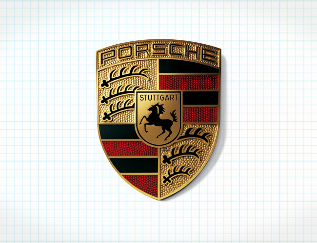
It would be hard to find a more attractive emblem than the famous gold, black and red Porsche crest. It is easily one of the most enduring emblems in automotive history, barely changing since its introduction in 1952, when Ferdinand Porsche set out to create an iconic emblem. Its most obvious connection is with the city of Stuttgart, where Porsche is headquartered. The city originated on a stud farm, hence the centrality of the horse. The antlers and the red-and-black stripes in the surrounding quadrants of the shield represent the Kingdom of Württemberg, a former state of the Federal Republic of Germany (Stuttgart is the capital). The unchanged appearance of the Porsche crest over the past several decades is consistent with the enduring legacy of its most iconic model, the 911, where the crest is displayed at the tip of its legendary flat nose.
Saab
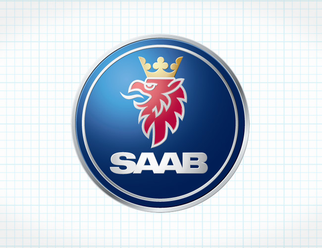
Saab’s heritage dates back to airplane production in the mid 20th century. The company Svenska Aeroplan AB (translated “Swedish Aeroplane Limited”) started producing cars in the 1950s, but the original logo symbolically bore the front of an airplane propeller. Eventually, it changed to a red Griffin with a golden crown sandwiched between the Saab-Scania name. The red Griffin is inspired by a Swedish coat of arms, and is also based on the logo of Vadis-Scania’s, the truck manufacturer that partnered with Saab’s parent company to form Saab-Scania. The most recent emblem, revised when GM took over in 2000, shows only the Saab name.
Subaru
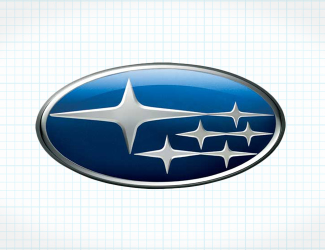
Subaru actually means “The Pleiades” in Japanese, referring to the the star cluster in the Taurus Constellation. The Subaru badge only shows six stars (Electra, Maia, Taygete, Asterope, Celaene and Alcyone) because those are the most prominently visible to the naked eye (depending on location, ambient light, etc.). In 1953, five companies merged as one: Fuji Heavy Industries Ltd. The five small stars represent the merged companies, and the larger sixth star represents the bigger firm.
Toyota
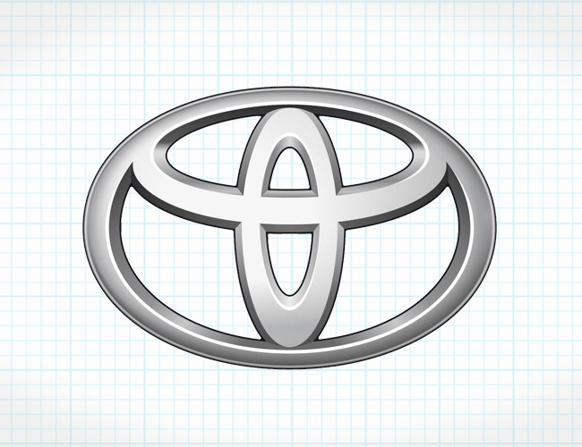
Most interpret the Toyota emblem as an artistic, albeit bloated interpretation of the letter “T”. The emblem, however, actually bears significant meaning. The ovals overlap one another, symbolizing trust between the automaker and its loyal customers. The white space that occupies the emblem signifies Toyota’s future potential. And the three ovals together represent the collective hearts of the customer, the cars and the technological opportunities ahead.
Volkswagen
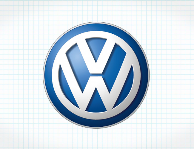
One of the largest automotive manufacturers in the world, Volkswagen, happens to have one of the simplest emblems in the business. Once again, an automaker uses an automotive emblem wrapped up in the ubiquitous circle, this time with a V for “volks” (people, in German) and the W for “wagen” (cars), with the former stacked on the latter. It’s appropriate, of course, for the people to ride on the cars, as opposed to the other way around.
Volvo
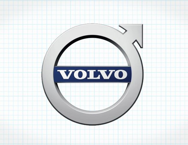
The Volvo name isn’t Swedish, despite the car’s origins. It stems from the Latin word “Volvere”, for “roll”. Volvo means “I roll”, which aptly captures the intentions of a car company. Volvo’s original emblem from 1927 was a blue oval with the Volvo name centered on the logo and Gothenburg, Sweden, the manufacturer’s location, on a banner beneath the name. Then, in 1930, Volvo began using its now-famous iron alchemy/Greek male/Mars, god of war symbol: a circle with an arrow pointing up and to the right. Volvo only recognizes the first association, of course. It’s meant to symbolize strength, protection of its customers, forward thinking and innovation. In 2014, Volvo simplified their already crisp emblem by moving the Volvo name completely inside the circle, as opposed to laying across its width. On their cars and SUVs, Volvo’s emblem is always coupled with an angled crossbar that matches the direction of the arrow, providing an easily recognizable face to their lineup. The fact Volvo hasn’t changed their brand image even after being purchased by Geely of China reassures that their priorities — safety and longevity — remain very much intact.
>
>
[Source : http://gearpatrol.com/2015/03/31/automotive-emblems-explained/]


Recent Comments